Affordability
Background
I've already written about how, contrary to popular belief, the median income has risen quite steadily since the 1970s. This page considers the related criticism that even ignoring income, the fact that specific expenditures are increasing makes it harder and harder to live a "decent" life.
It's worth pointing out that since the CPI and GDP deflator include all price increases already, this argument is effectively already accounted for in my earlier analysis; however, I wanted to investigate these particular claims anyways.
In particular, I look into the cost of houses, the cost of college tuition, and the cost of health care. I end up finding that housing is actually very cheap relative to historical levels and that college tuition is either flat or has risen by only \$2k over the last two decades. I'm less confident about health care. It does look like that prices are rising faster there than for other services, but due to imperfections in CPI, its difficult to tell for certain.
Housing
While people have complained about the cost of housing since time immemorial, in truth, their thinking is typically muddled. For instance, while almost all new housing is expensive, this has always been the case historically, with lower-income people moving into older homes and wealthier people moving into new ones - not dissimilar to cars.
Instead of comparing the prices of new homes to old homes, we need to see how the price of a specific home changes over time to get an apples-to-apples comparison. Of course an individual home isn't super illuminating, so economists do this for lots of homes and average the price changes together to create the Case-Shiller index. After adjusting for inflation (CPI), the graph for US homes looks like
The two exceptions to this rule are that housing became noticeably more expensive post WWII and throughout the 21st century.
The first exception can largely be blamed on government policy. During WWII the government banned new domestic housing construction except for defense purposes, while after WWII the Veterans Administration guaranteed millions of home loans HUD's Historical Timeline. Both these moves dramatically and artificially increased the demand for housing.
I used to think the boom in the early 2000s was just a temporary surge due to issues leading up to the 2007 subprime mortgage crisis since prices eventually fell to late-90s levels. However, the significant rise in prices since then have started to change my mind.
All that being said, there is to more to the cost of housing than a home's price. Most noticeably, since most homeowners borrow to buy their home, the monthly cost of a home is just as much determined by the interest rate on the mortgage. In particular, the formula for a monthly mortgage payment is the value of the mortgage multiplied by
$$ i \frac{(1+i)^n}{(1+i)^n-1} $$where $i$ is the monthly interest rate and $n$ is the number of months.
After adjusting for this using the average 30-year mortgage MORTGAGE30US, we achieve a monthly-payment version of the Case-Shiller index. Unfortunately, I only found data going back to 1971:
Unfortunately, I couldn't find typical 30-year mortgage interest rates going back farther than 1971. However, mortgage interest rates are typically ~1.6% higher than the rate on 10-year treasury bonds DGS10:
From these charts, it is made pretty clear that the monthly cost of housing has fluctuated quite a bit, but that it's roughly as expensive to buy a house now as it was in ~1970. Admittedly, before 1970, home mortgages were probably significantly cheaper (reaching a nadir during WWII), but I don't think anyone can look at these charts and think it's reasonable to conclude that Millennials have it significantly worse than the two generations before.
What about cities? Maybe its just more expensive for "successful" young people who want to live in big costal cities?
Maybe. You can take a look yourself at fred.stlouisfed.org, but its really city-dependent, and the data only goes back until 1987. Between then and 2021, prices rose ~22% slower in the Chicago and New York metro areas relative to the nation as a whole. In metro areas on the west coast prices typically grew ~45% faster with prices growing a whopping 69% in San Francisco. The other cities I looked at showed other (typically smaller) devotions from the national trend.
College
Unlike housing, the quality of college instruction probably hasn't changed much over the last several decades. It was and remains largely (a) a lecturer teaching students (b) students doing homework and getting feedback (c) some smaller discussion- or lab-based classes. The main exception to this is room and board, which (at least anecdotally) has gotten much nicer. For this reason, we'll be focusing on tuition to make sure we're doing an apples-to-apples comparison.
Nevertheless, average published tuition has risen 2.1% faster than inflation over the last 55 years. This is bad enough, but that statistic actually hides the true increase in tuition prices since people are shifting from expensive to cheaper options. For instance, among 4-year and 2-year public schools, the increase has been 2.8% and 2.6%, respectively, while among 2- and 4-year private institutions tuition prices have increased by 2.5% and 2.0%, respectively Table 330.10.
The obvious explanation is that most of this increase is due to price discrimination: colleges raise their sticker price to milk their wealthy students for more money while providing greater financial aid so that typical students don't see much of a change.
This explanation is at least plausible since the percent of students receiving financial aid has increased over the last couple decades Sources of Financial Aid and the average amount of financial aid they receive has grown as well Table 331.20. For instance, between 2000 and 2017, the percent receiving financial aid rose from 70% to 84% while the average grant size increased by 51% - and that's all ignoring the billions of dollars in guaranteed and subsidized loans.
Research by the College Board suggests that financial aid has generally reduced the true growth of the cost of college Average net price by sector over time. For instance, the net price of tuititon at 4-year nonprofit college has remained flat over the last 20 years even while the sticker price has increased ~50%.
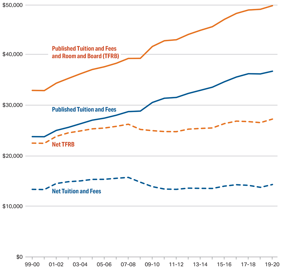
The evidence is more mixed for 4-year public colleges. Over the last 20 years, the cost of tuition has doubled even after accounting for inflation and financial aid. That being said, financial aid still makes attendance much more affordable, with average tuition paid shrinking to around \$4k per year.
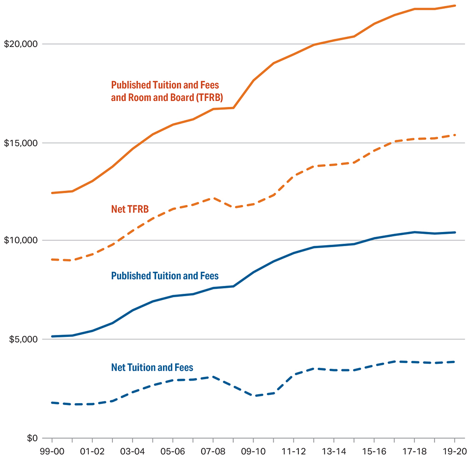
The story for 2-year public schools is even stronger, a small drop in the net price of tuition adjusted for inflation.
In short, after adjusting for inflation and financial aid, the cost of tuition has remained flat at nonprofit and 2-year public schools, while increasing from ~\$2k/yr to ~\$4k /yr at public ones.
I should also point out that since college is a service, most of its cost is labor. As mentioned, mainstream college hasn't really seen much productivity-enhancing innovation. These two facts strongly suggest the price of college should rise faster than inflation Baumol's cost disease. I consider a mild miracle that this has only actually happened at 4-year public schools.
But what about student loan debt? Haven't you heard that there is \$1.5 trillion on student loan debt and that the average debt of bachelor degree graduates is \$32,000?
While that \$1.5 trillion on student loan debt sounds terrifying, that's only ~\$4500 per capita. That \$32,000 figure is the average of people who graduate with a Bachelors and have student debt Fast Facts: Student Debt. About 1 in 3 people get a Bachelor's degree and about 2 in 3 of them borrow, so it'd be more accurate to say the average debt of the top third of indebted students is \$32,000. Among all Bachelor degree graduates, it should be around \$20,000, and for all people of that age, the average should be around \$10,000.
And that's the mean, not the median. Debt is largely held by rich (less financial aid) and more educated households Looney.
I don't mean to completely belittle the rise in student loan debt. It has dramatically increased over the last couple decades. However, this is largely driven by things like (1) more and poorer people going to college (2) more people pursuing advanced degrees and (3) increased room and board costs, which are presumably accompanied by improved dorms, food, and facilities.
Finally, there is some evidence that the quality of education has improved in that class sizes have gone down over time Wentworth.
Health Care
Health care costs are by far the trickiest to examine since (a) it's the most heterogeneous; (b) its abilities have expanded the most, making apples-to-apples comparisons difficult; and (c) the price structure of our health care system is wildly complicated and opaque causing the same procedure to have multiple different prices.
For instance, controlling for inflation, health care has grown by nearly 4% per year for the last 4 decades DHLCRC1Q027SBEA CPIAUCSL. The question is how much of this is due to (a) newly invented procedures (b) more procedures (c) improved quality of procedures and (d) actual increase in price.
As far as I can tell, the only way out is to choose a very standardized procedure that hasn't changed much and look at its price over time. In principal this is exactly what the CPI does, though it is generally agreed it is imperfect and therefore overestimates the true increase in prices for three reasons United States Academic Decathlon:
- substitution bias - CPI is a Laspeyres index
- unmeasured quality bias - researchers attempt to adjust for quality improvements in goods over time, but this is hard to do perfectly
- new goods & services - new goods often dramatically fall in price their first couple years of existence, when they're usually not in the CPI basket of goods
That being said, I don't see a better alternative.
The CPI for medical care has been rising faster than the overall CPI since at least 1950, averaging 1.7% faster per year CPIAUCSL CPIMEDSL. Services in general grew only 0.7% faster than overall prices over that time Table 1.1.4, which leaves a 1% unexplained gap. It's possible the three biases I mentioned above are more prominent in health care than other services, which makes me uncertain whether that 1% gap is real or due to methodological error. If that seems unreasonable, consider that a government report estimated CPI as a whole was biased upward by over 1% The Boskin Commission Report, so expecting twice that kind of discrepancy among health care seems plausible to me.
[ As an aside, the fact that services grew 0.7% faster than overall CPI is nearly equal to the 0.7% growth in median income. This makes some sense due to Baumol's cost disease Baumol's cost disease. ]
Finally, I'm just going to leave this here.
Conclusion
The stories about how things are becoming less affordable are strongly overstated. In practice, housing is cheaper than it was for the previous two generations while net-tuition has been roughly flat over the decades even as college quality has improved. The price of health care may rise a little faster than normal service-based inflation, but it's plausible this is entirely accounted for by increased usage and quality of health care.
Moreover, median after-tax compensation has risen about 1.1% per year in real terms over the last several decades. So, at least for the median household, most of these spending categories are significantly less expensive than they used to be in turns of the hours of work needed to afford them.